Wayfinder Design System
Team
Other designers, Research, Analytics, Developers, Product Manager
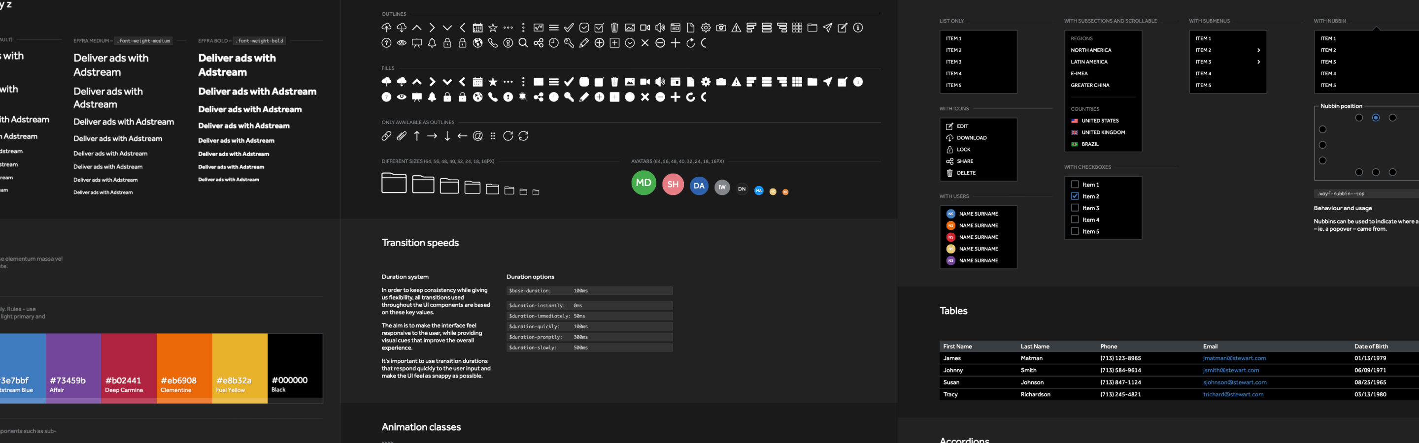
Table of contents
About the project
This was an effort to lay a foundation for all of Adstream’s future products, facilitate the work of both design and development teams, reducing the time it takes to create and deploy new features or modify existing ones by creating a UI pattern library that is part of a solid design system that unifies all of Adstream’s products under the same visual identity.
What I did
I worked closely with the senior interaction designer and a team of developers to create a comprehensive design system from the ground up that worked across all devices and platforms. Doing research, creating the structure of our design system, visual designs, running tests, creating interaction prototypes, all sorts of UI/UX explorations, specifications, documentation and overseeing the final implementation.
As the design system is an ongoing effort, I am also responsible for considering potential updates to it, new additions in terms of components, and making sure we are using our components correctly and consistently as our platform evolves.
Key accomplishment 🏅
The implementation of a well-structured design system has freed up an estimated 220 hours man hours per employee per month across both design and development teams which can now be allocated to other tasks.
Objective
The current version of the Adstream suite of products (v5) was built circa 2011-2013 and its parts were designed and developed by many different teams — some internal, some outsourced. As a result of that, both the user interface and common interaction patterns differed greatly across Adstream’s range of digital products.
When we first started discussing v6 of the platform, we knew that was the perfect time to devise a solution that made it possible for anyone, anywhere to create experiences that felt part of the same ecosystem, while making it easier for whoever is creating it to do the right thing, regardless of them being a designer or a developer.
Design for spread and scale.
Denise Gershbein, Creative Director at frog
It was clear that we needed to put a stronger focus on our UI Pattern Library and this should be more than just a cosmetic endeavour. It should be a comprehensive design system and flexible enough to adapt to the ever-changing needs of this industry and our business.
Research
Components
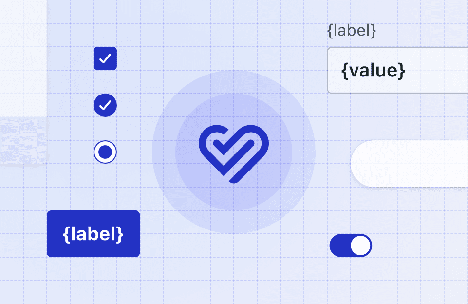
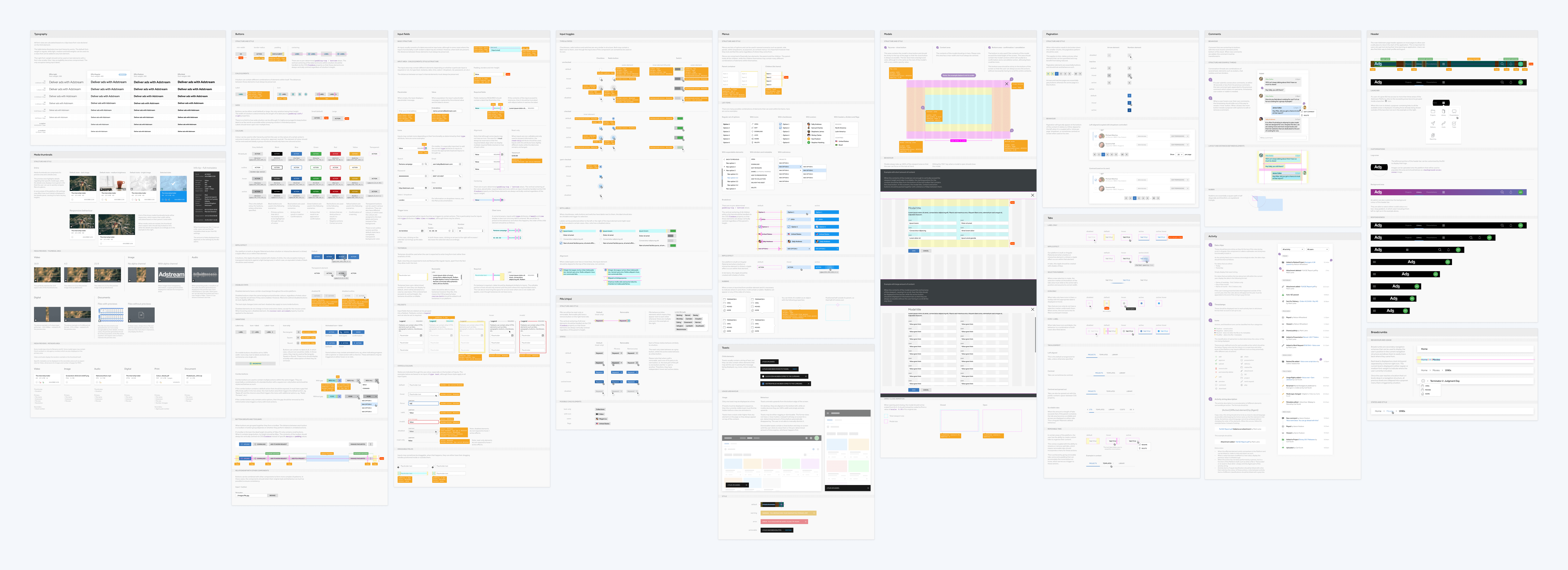
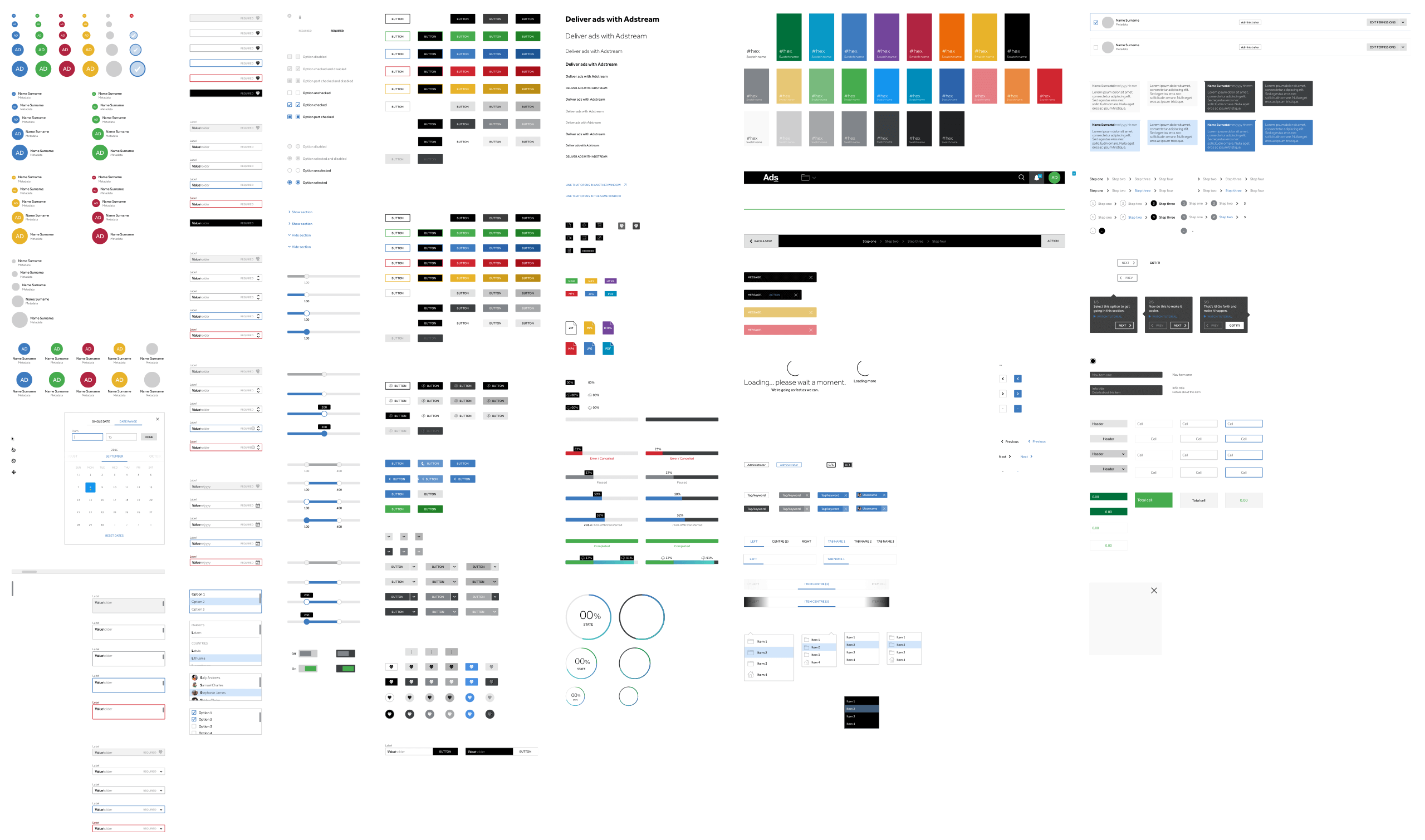
I started out by looking at each of Adstream’s products and discerning common patterns and components. From the most basic such as labels, icons, buttons, checkboxes, radio buttons, dropdowns, accordions; to more complex combinations such as panels, user tables, different types of modals, and so on.
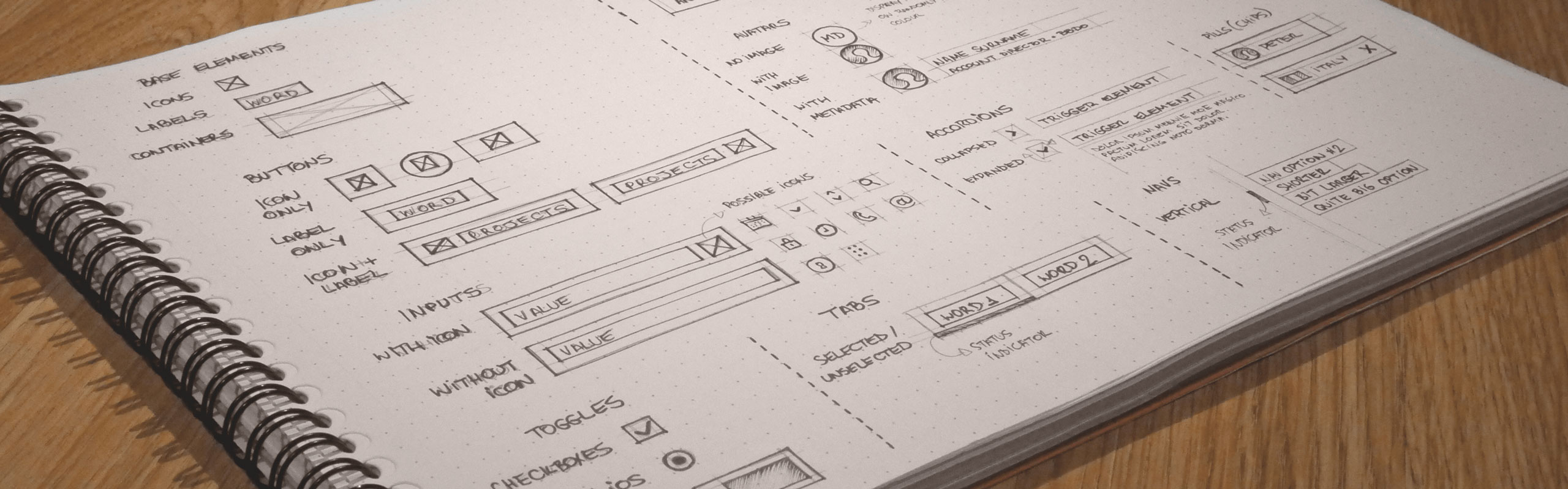
Having this granular approach allowed me to see the pattern library as a modular set of blocks we could put together to form larger and more complex structures. I didn’t go full on Atomic Design on this project but I did keep some of these principles in mind when categorising elements which definitely helped speed up the process and tie everything together nicely.
Deciding on a framework
The next step was to work with the development team and see what was readily available on the framework they were using to build the new version of the platform. Luckily they were using Angular Material which comes pre-packed with lots of useful components we could work with without much hassle. Some components would require a small amount of customisation, but for the most part, Angular Material provided a very solid starting point for what we wanted to achieve.
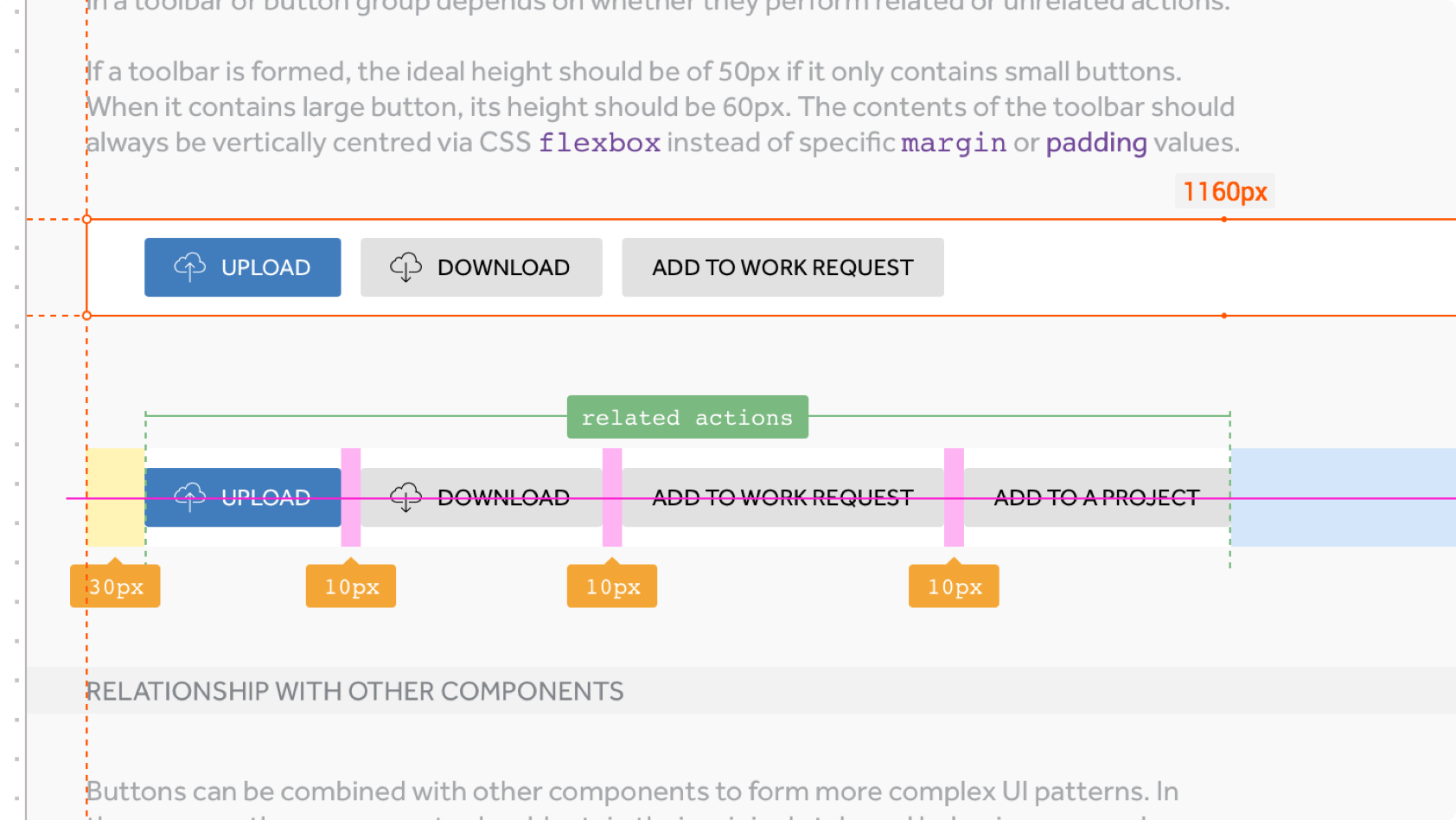
Grid
We chose to use a 1280px max-width grid system with 12 columns and 32px gutters as that provided greater flexibility for the most common scenarios in our platform. It’s important to keep in mind that this should never hinder us from pursuing other layouts if we believe those would be more usable. Having a grid system shouldn’t be a constraint. It should serve as a foundation on top of which you can build your product, but concessions must be made here and there.
To say a grid is limiting is to say that language is limiting, or typography is limiting.
Ellen Lupton, Curator of contemporary design at Cooper-Hewitt National Design Museum • NYC
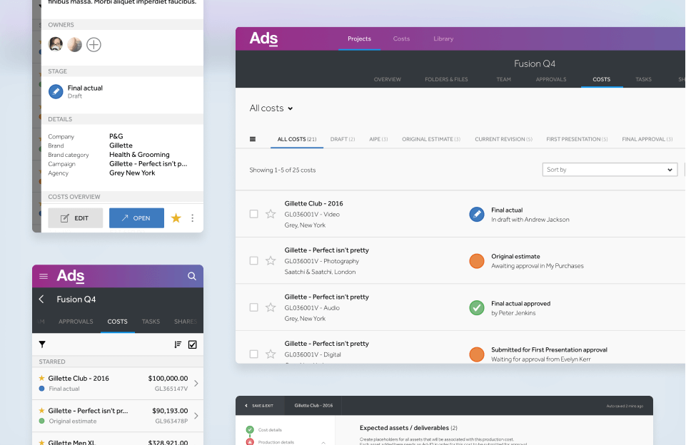
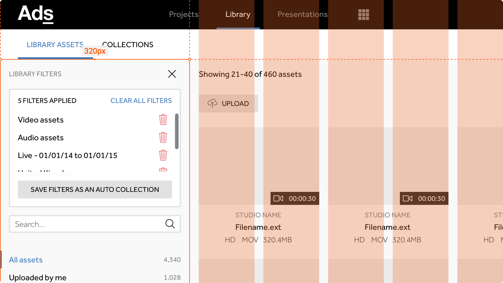
As an example, on the Adstream Library, we have a fixed side panel of 320px on the left and that’s always there regardless of what device you are on. However, the main view to the right of this panel contains thumbnails of your assets, within that view we apply our 1280px grid, but in this particular case, the 320px panel is excluded from the grid. This allows our users to use their full screen real estate to preview their assets in the Library, which we validated as a better solution than constraining them to 1280px at all times for this particular case.
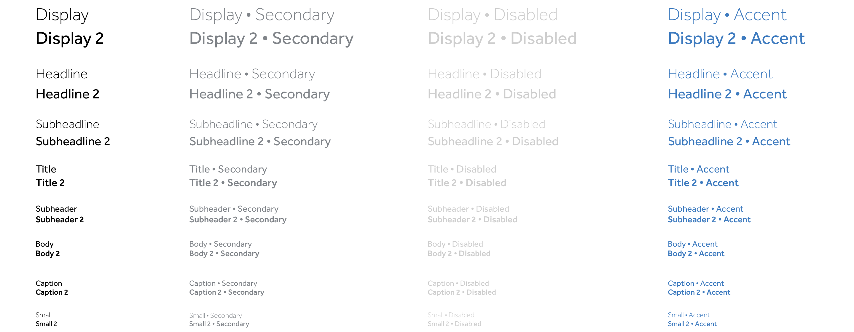
Typography
Typography and semantics are very important aspects of what makes a web application accessible to users who rely on-screen readers. For this reason, our approach to typography was to not use elements such as h1, h2, h3 to determine style. These elements are used for content hierarchy, making it easier for screen readers to consume the content and their style is limited to a specific font-size set in rem for which the base size is 16px. Styles such as font-weight, color, are all applied as modifier classes such as .font-weight-light, .font-weight-medium, .font-weight-bold, etc.
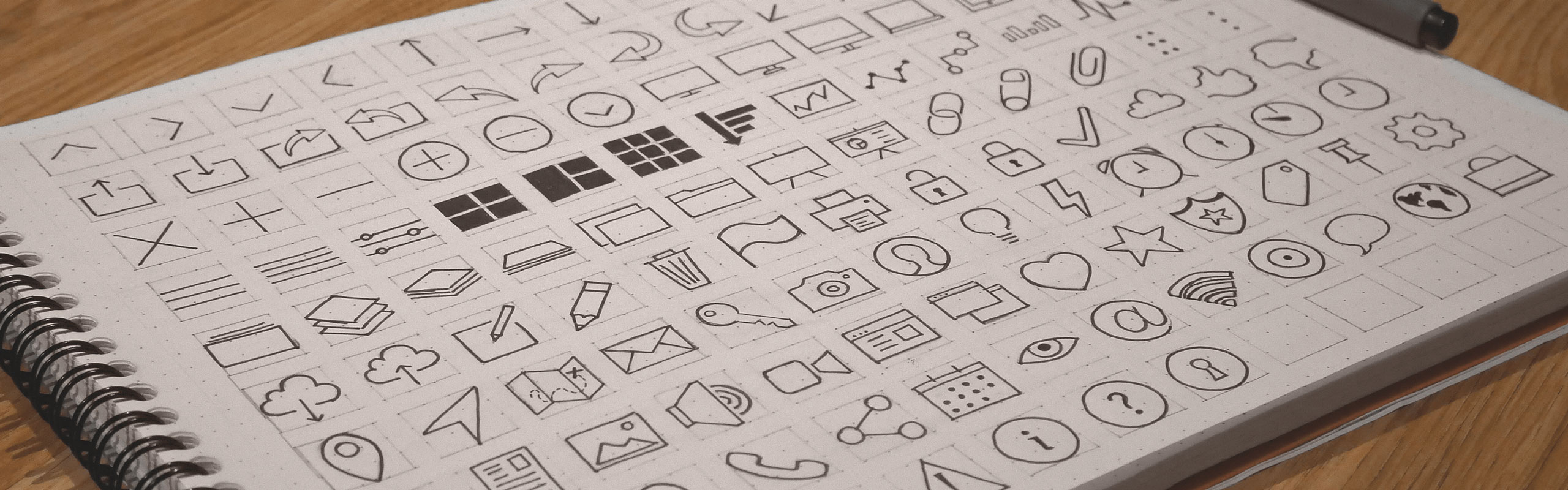
Iconography
We used an icon set that is based on a 32px grid size and 2px lines. The idea is to refine and redesign them as our product and brand evolves.
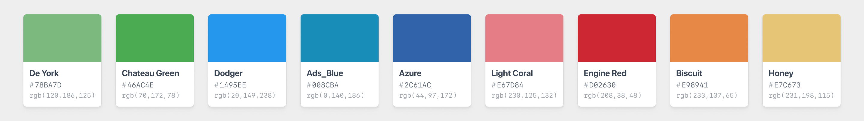
Colours
Colour is a key aspect of any interface and our approach to colour is to use it just enough to hint the user in terms of statuses, intents and visual cues that will make for an easier journey through their daily workflows. We do have a large set of colours to pick from, but the aim is to stick to as few as possible while thinking of the journey as steps. Never having more than one accent colour per step.
Primary
These are used for important actions and are bright and bold.

Secondary
These are used to support primary colours when necessary. They are slightly less saturated and lighter versions of our Primary palette.
Shades of grey
We would in some parts of the platform, have a need for a dark version of our UI. I kept this in mind when defining this palette. This is why we’ve got plenty of shades of grey to pick from, but essentially every colour on the shades of grey palette has an equivalent counterpart that provides enough contrast against a dark background and this principle applies to every component.
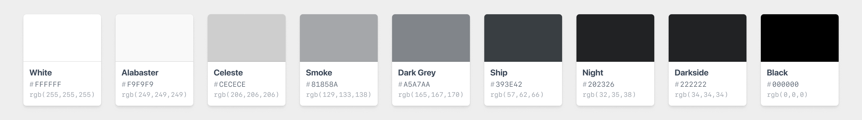
You can literally drop a .dark-ui modifier class to an entire section and have all its children adjust accordingly.
Visual design
After deciding on solid grid and type systems and defining the colour palette, I then started designing each component with their different states in a manner that brought the entire library together and gave a sense of unity to the user.
Instead of prescribing the appearance of individual items, we build systems to anticipate them.
Heydon Pickering,
Author of “Apps For All: Coding Accessible Web Applications”
At this stage, I ran lots of tests in HTML, CSS to see what was reasonable and these tests combined eventually went on to become a framework of its own that I ended up using to develop future high-fidelity prototypes for other areas of the platform when required.
During the development of these tests, I used a BEM approach in terms of naming conventions for states and modified versions of components. Having a background in front end development gave me great insight into how I could make it easier for developers to implement this pattern library as well as how we could make it extremely flexible, scalable and somewhat future-proof – at least for a while. 😉
Semantics have always been very important in the realm of web development, especially when dealing with large enterprise level software. I’ve kept this in mind when developing these components, what this means is that wherever possible, elements use their correct HTML tags when available. This applies to button, input, nav, detail, ul, ol, li, table, and so on.
Framework Prototype
Preview it here
Made with: HTML, CSS, JS & jQuery
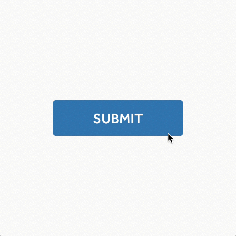
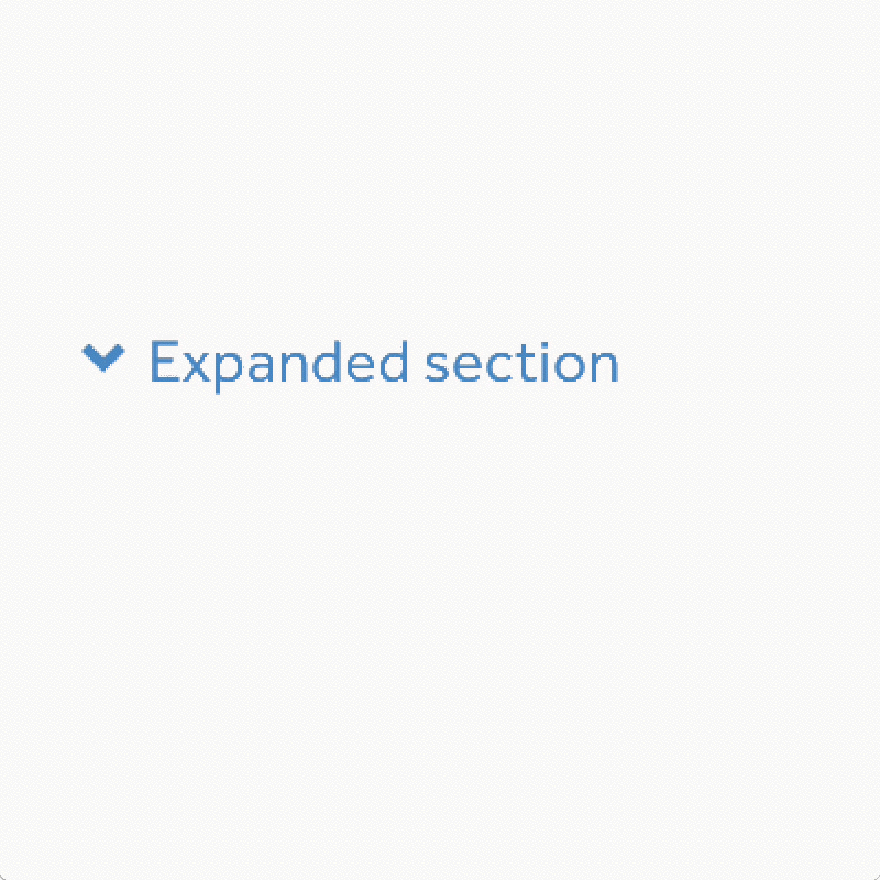
Interactions & micro-interactions
Below are some examples of the way we envisioned the micro-interactions on some of our components.
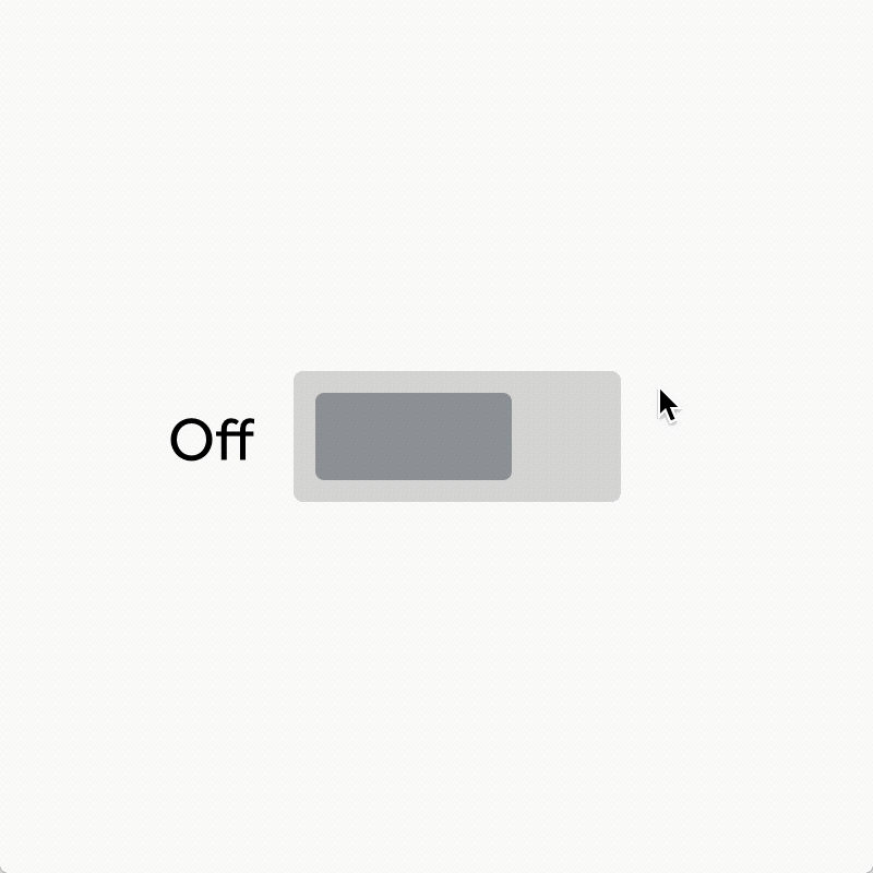
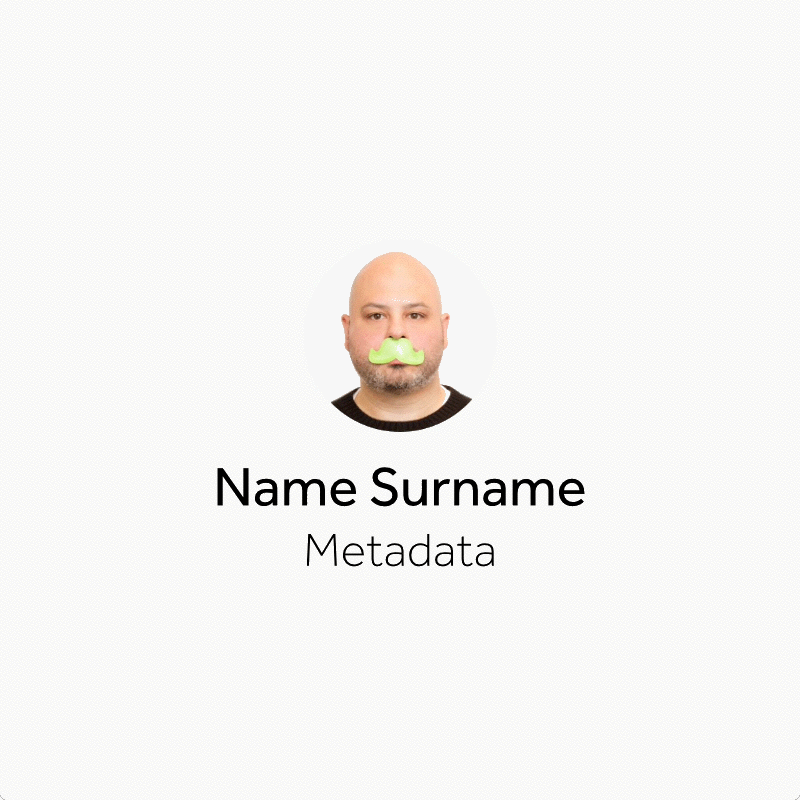

Internal resources
Sketch symbols library
Considering we in the design team at Adstream spend a lot of our time in Sketch, I’ve created a symbol library with all of our components that has really helped speed up our process when creating comps or even final designs.
I’ve also revised it since the introduction of responsive symbols in Sketch 4.0 and have now made most of these components easy to adjust to whatever screen size we are designing for.
The file also contains all of our text styles and color pallettes so that our designs are always consistent and we don’t need to ‘reinvent the wheel’ at each new project.
The framework
I also like to exemplify things with code when necessary. This really helps ground my work and convey my ideas in a more direct kind of way to our devs since HTML and CSS is ultimately the media these components will be based on. While some great looking things can be accomplished in the prototyping tools available these days, some ideas simply don’t translate well to real life scenarios.
Here are some of the components I exemplified with code:
Tabs
Preview it here
Made with: Angular Material framework — HTML, CSS & JS
Tooltips
Preview it here
Made with: Angular Material framework — HTML, CSS & JS
Toasts
Preview it here
Made with: Angular Material framework — HTML, CSS & JS
Radio buttons
Preview it here
Made with: Angular Material framework — HTML, CSS & JS
Comments
Preview it here
Made with: Angular Material framework — HTML, CSS & JS
Menus
Preview it here
Made with: Angular Material framework — HTML, CSS & JS
Modals
Preview it here
Made with: HTML, CSS & JS
Using HTML, CSS and JS allows me to run quick experiments and tweak the details that will bring delight to our users like transitions, animations, easing curves and how responsive each component feels.
It started as a set of quick experiments but after a while I had gathered enough to compile our own framework of components.
We currently use this framework in specific cases where we need high-fidelity prototypes.
Specs & production
A design system is only as good as its documentation, so we have been documenting all the components with Zeplin and working closely with the developers in bringing them to life one by one.
The new modules of the Adstream Platform (Library, Costs, and soon Delivery and Tasks) have already been designed with those new components and we are now in the process of rolling them out to our first users.
Conclusion
Having a pattern library in place has drastically improved our productivity. We are now able to spend more time prototyping, implementing, testing and iterating on ideas, instead of thinking about mundane things like how buttons or inputs should look or work. It lets us think of the bigger picture and be more… agile — there, I said it. 😬
It’s also great in the sense that we no longer get attached to our design decisions since they’ve essentially already been made for us, this allows us to ruthlessly scrap ideas that aren’t working and come up with new ones.
We need to stop worrying about proving the value of design and just focus on outcomes that provide value.
Denis Weil, Innovation Executive • formerly at McDonald’s
That said, a pattern library is an ongoing process. It should never really be finished. Components can now safely be improved upon and tweaked since they are their own modular entities and this allows us to revisit them often and make adjustments that won’t require an entire restructure of our platform or a massive version release.
References
When developing the Wayfinder pattern library I’ve used several online resources with the best ideas I could find to make the best possible solution. I’ll link to them below and hope you may find them useful:
Resources
- Off-canvas navigation
- BEM methodology
- CSS Guidelines
- CSS-Tricks — Flexbox
- CSS-Tricks — Don’t overthink it grids
- Baseline grid
- CSS Transitions
- Responsive Tables
- Vertical rhythm
- Box-sizing
- Icomoon