P&G AdCosts module
Duration
Jun 2016 – Sep 2016
Role
Product Designer
Team
Lead Product Designer, Project Manager, 4 Web Developers

Table of contents
About the project
Adstream partnered up with P&G to develop an advertising production costs estimation module within the Adstream Platform’s Projects area that – according to P&G’s estimates – will save them approximately US$500 million a year by allowing them to track their production expenditures every step of the way.
What I did
I collaborated with our internal Strategy and Accounts teams, as well as with P&G, their partner agencies and real users from end to end, ranging from interpreting high level requirements, producing flows, scenarios, sketches, wireframes, user tests, visual designs, interactions and micro-interactions and all sorts of UI/UX explorations, as well as adapting the entire experience to mobile devices.
During the process, I worked closely with the senior interaction designer, the product manager and a team of developers.

Key accomplishment 🏅
This new module saves P&G US$ 500 million a year allowing them to precisely track advertising production expenses and solidifies Adstream’s presence in P&G’s global workflows, which in turn leads to a stronger relationship and further revenue being secured for years to come.
What is Adstream?
The Adstream Platform is the world’s leading cloud-based advertising workflow and collaboration software (SaaS) tool used by brands, agencies, studios and broadcasters worldwide to manage and deliver global creative content in both traditional and new media formats, connecting content to over 40,000 global destinations in over 116 countries. Everything on the Adstream Platform is searchable and reportable.
Adstream and P&G
The Adstream Platform has been a growing part of P&G’s marketing and advertising workflow in the recent years. P&G already uses the modules available on the Adstream Platform to manage their Projects, Asset Libraries, Reports and Deliveries between agencies and broadcasters worldwide and mandate all partner agencies and their third parties to run their workflows within our platform due to its transparency and reporting capabilities.
Considering P&G is the world’s top advertiser in the world having spent US$8.3 billion in advertising in 2015, a key part of their workflow is being able to set a budget for a given project and estimate production costs that stay within this set amount, while accurately tracking where money is being spent and the changes that happen along the process; From estimation, to an indefinite amount of revisions, first presentation, final approval through to delivery.
Prior to the existence of this new module, P&G was able to run their entire workflow within our platform, except for this estimations process for which they used an internal legacy tool.
The addition of this new module effectively turns Adstream into a complete end to end solution that handles the entire advertising workflow.
Once developed as a custom solution for P&G, we will monitor it, gather our learnings and roll out the new module to more Adstream customers as part of the Projects area.
The brief
Business objective
Our challenge was to design a replacement solution to P&G’s existing dated tool for content production cost management, aka ‘AdCosts’.
The purpose of the solution is to effectively gather and highlight changes in content production costs from the original estimations, in order for P&G to approve, contain and report on them within the Adstream Platform.
As part of the solution, Adstream are also required to build the mechanisms for triggering the creation of Purchase Orders (for the costs captured within the Cost Module), through integrating with P&G’s finance system, COUPA.
Problem to solve
The current system is fragmented, inflexible, lacks transparency and reporting capabilities, and isn’t as user friendly as users would like it to be. It also involves a good amount of manual work which ends up costing several man hours and decreases the efficiency of all parties involved in the cost estimation process.
Constraints
The system should have restrictions to allow users to only view and approve costs based on their user rights and access limits.
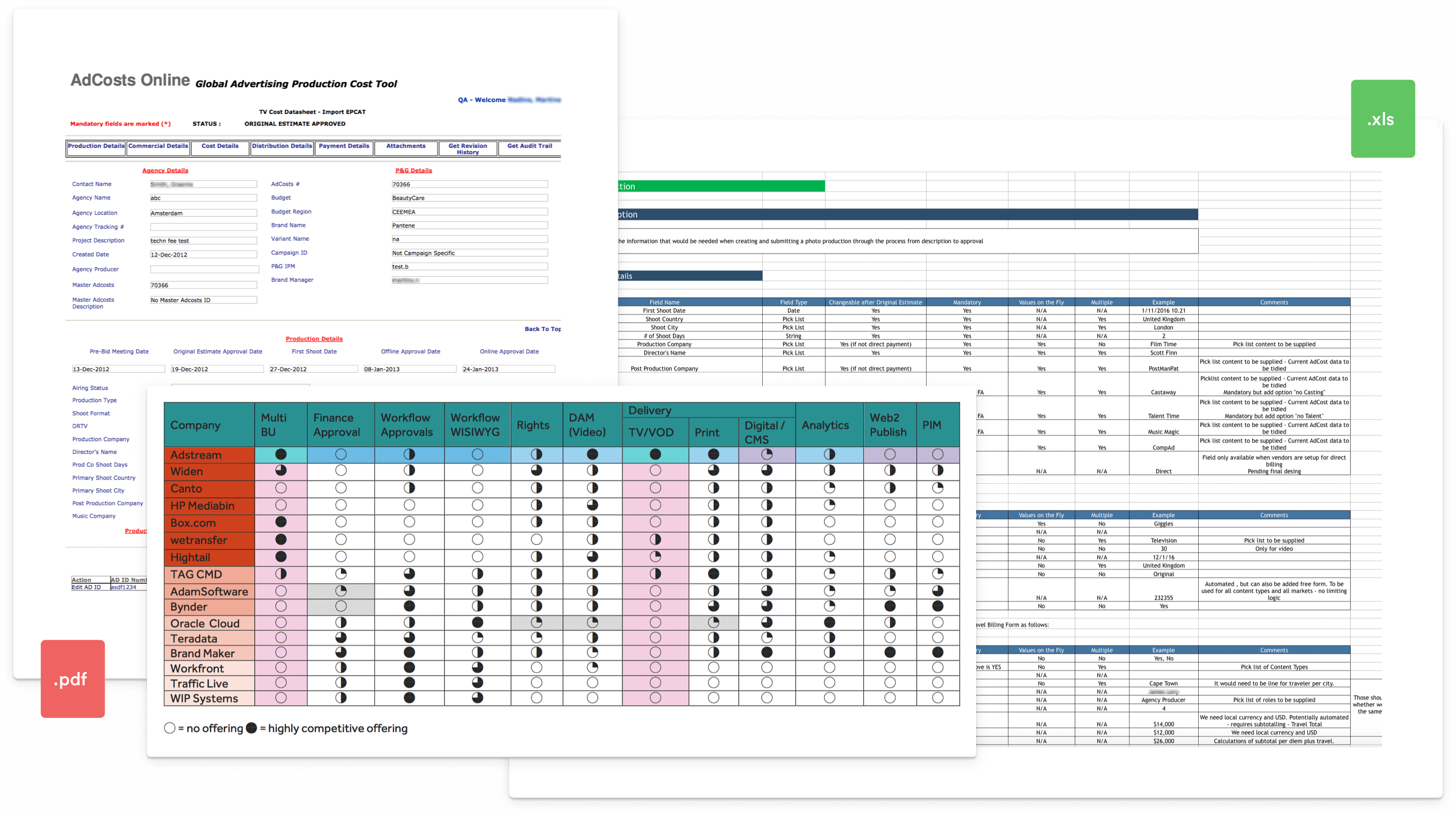
P&G provided us with exports of what their current tool outputs. This current implementation is a legacy tool that’s been used for several years throughout all of P&G’s offices worldwide and is a big part of their current workflow – not to mention their culture – so it’s important to maintain the same output while improving on the user experience and expanding on functionality.
The ideal scenario is to develop a tool that satisfies P&G’s needs but can also be spun off into a more generic tool that can appeal to other potential Adstream clients and partners.
Design goal
Optimise workflow, increase efficiency, reduce the amount of time it takes to create, review and approve a cost, all while offering more granular, transparent and complete reports.
Who is it for?
The Costs module will be used by all parties involved: agencies, 3rd party providers and P&G themselves on various levels of access determined by the scope of each production project.
Agreed scope
- Ability to fill out the cost form in a non-linear fashion; Auto-saving feature so users can come back later to finalise creating a cost and submit only when they’ve gathered all the required metadata
- Ability to add multiple production, post production, music, 3D, CGI / Animation vendors and having this reflected on the total costs overview broken down by types of expenses
- Ability to add as many revisions as necessary to a cost in between the key stages (AIPE, Original Estimate, First Presentation, Final Actual)
- Ability to see what changes were made to a cost from its previous stage
- Ability to reopen a cost after its final approval. It’s not an ideal scenario, but a necessity nonetheless
- On costs where the budget region isn’t North America, ability to upload a budget form (xls or csv file) to auto populate the costs table with individual line item values
Process
Although not a strict rule, the usual process I follow is:
Research › IA › Wireframe › User test › Visual design › Prototype › User test › Report › Review
I’ll then iterate, refine and retest assumptions as necessary. The process I followed for this particular project wasn’t too far off from this and a more detailed explanation is described below.
Pre-study
- In testing the viability of taking this project, the Strategy team raised a list of competitors and carried out a competitive analysis from which the key finding was that by adding this new module to our platform we would become the only player capable of offering true end to end solutions to the advertising workflow. We as designers took this competitive analysis and used it to evaluate how our competitors managed a similar process. This list included Bynder, Widen, Workfront, Oracle Cloud, and many others.
- Our Strategy and Accounts teams liaised with the client to structure and approve a document with the technical requirements for this project.
- Since we did not have access to the current tool we were designing a replacement for, we started out by analysing reports exported from said tool and reverse engineered them in order to be able to – at the bare minimum – recreate the same output.
- We also gathered a list of required metadata fields for each part of the process. This included logic-driven metadata collection which this Costs module heavily relies on.
Discovery phase
IA
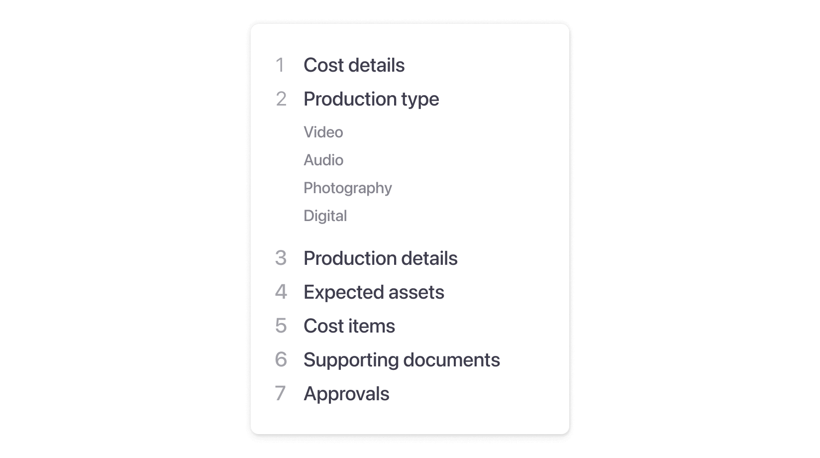
We looked at the required metadata fields and developed a simple flow that streamlined the cost creation process, determining at which point to collect the required metadata and breaking the process down into smaller chunks.
This was already a big shift from P&G’s legacy tool which was designed to gather all metadata in one single – and massive – form, regardless of budget amount, production type or region.
We wanted to simplify this by introducing the concept of progressive disclosure and making the cost creation process contextual to the production type selected by the user in an attempt to reduce the cognitive load and consequently decrease the time it took to complete the task.
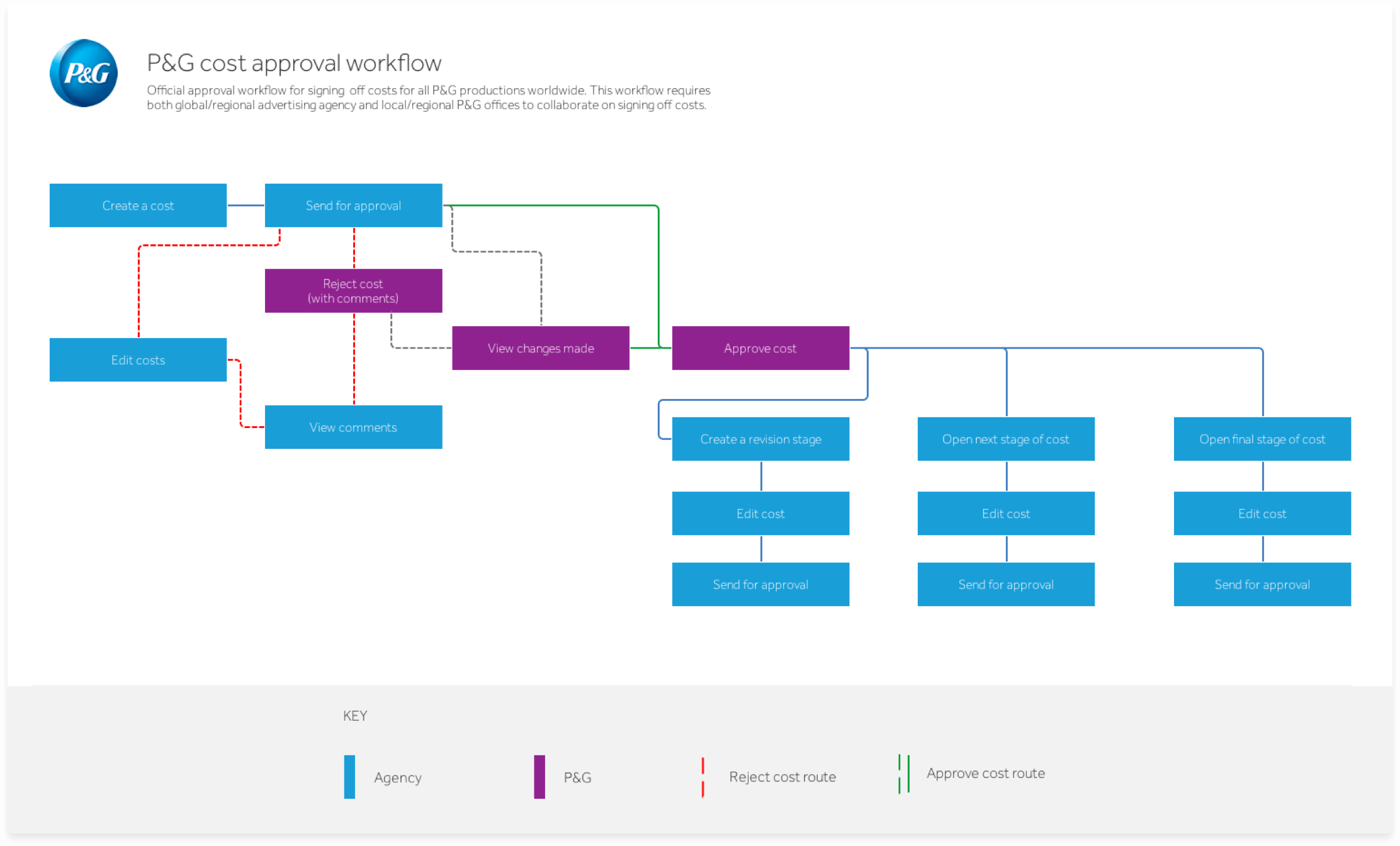
We devised several potential workflows/scenarios for the high level usage of the costs module. The workflow below illustrates an Approval from the primary perspective of an Agency, but also includes how P&G would interact with this agency during the process.
Since everything revolved around the creation of a cost and we now had a clearer idea of what that would be like, we then started thinking of what other parts of this system would need in order to function and created the following structure we named ‘tracks’:
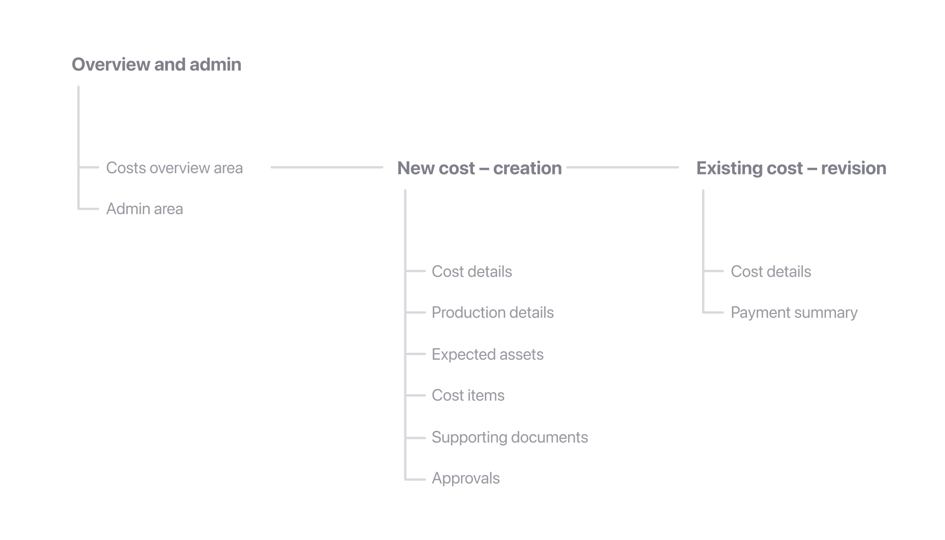
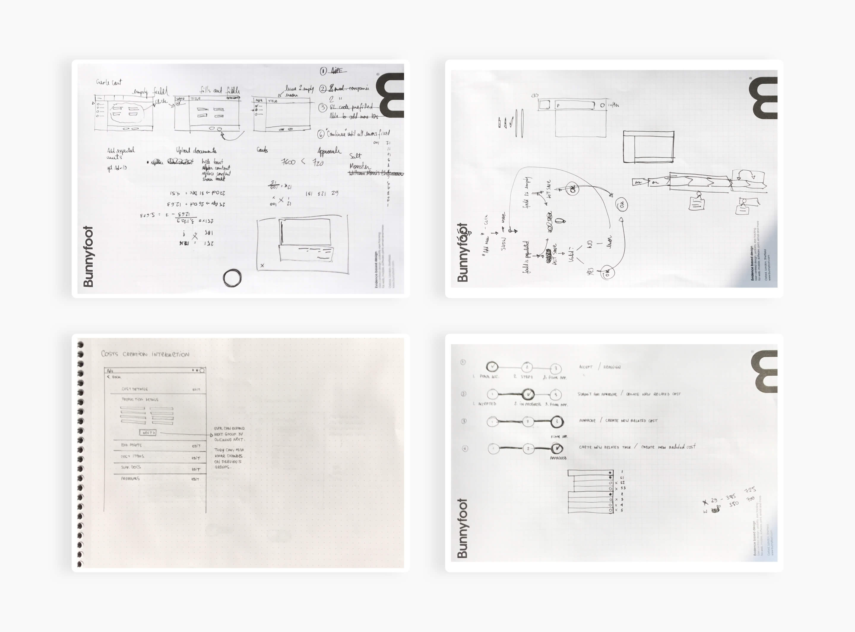
Sketching
At this stage I started sketching things out as a way to prioritise content and exemplify the overall navigation patterns for creating a cost and a costs overview area the user would see when a cost was created.
We started experimenting with different navigation approaches such as steppers, accordions and wizards, which we would eventually come back to refine during the visual design phase that came after initial testing.
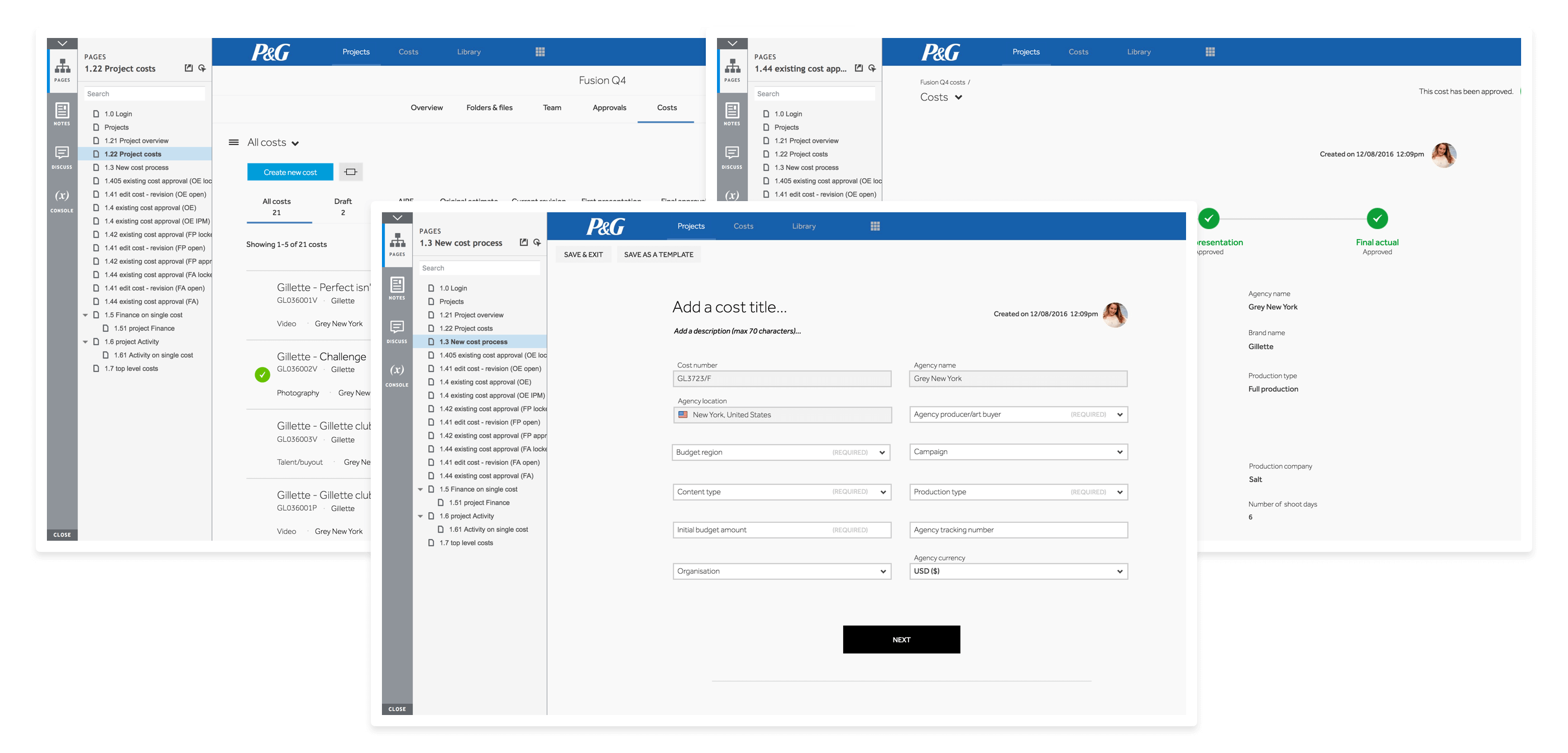
Wireframing
We then moved on to laying out basic rough ideas of the structure of these pages. Below is an example of the Costs Overview area. These were very crude-looking, but served the purpose of laying the foundation for the basic structure of the data collection process and how things would be placed around the screen.
Prototyping
Once we had a good grasp of the ideal structure of the platform, what the user journey would be and how we would approach collecting the user data, we presented our ideas back to P&G.
The overall feedback was positive and our solutions were making sense, but we noticed the abstract nature of the wireframes were a slight barrier in our communication with them at this stage.
For this reason we felt the best course of action was to use a higher fidelity prototype, using as close to our real UI elements as possible in an attempt to remove this barrier and create as few distractions to our test subjects as we possibly could in an attempt to get more reliable data to work with.
We started polishing up the wireframes and bringing them up to speed with Adstream’s new UI language before moving on to building them as prototypes for our initial user testing sessions.
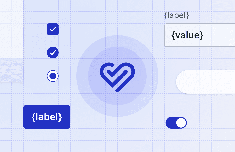
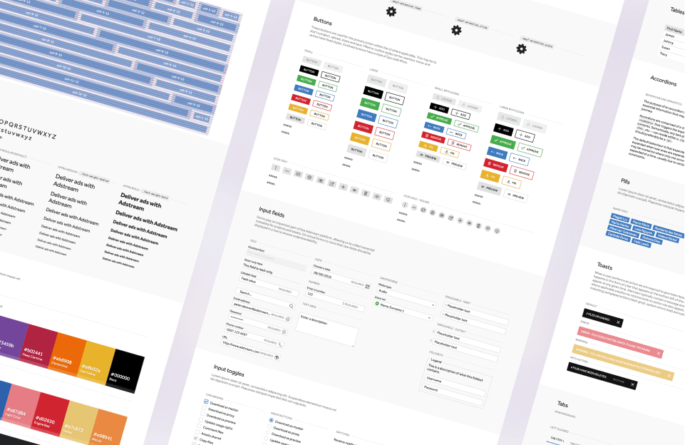
As part of the creation of the Wayfinder Design System we were developing in parallel, I created a set of Sketch symbols with our essential UI components that really helped speed up this process.
These prototypes were then built in Axure with some added logic-driven conditions for us to monitor.
User testing
For the usability sessions, we built 3 prototypes along with scripts based on key use cases:
- Scenario 1 – 1 agency + full video production with shooting
- Scenario 2 – 1 agency + 2 costs within the same project
- Scenario 3 – 2 agencies + video production cost
Methodology
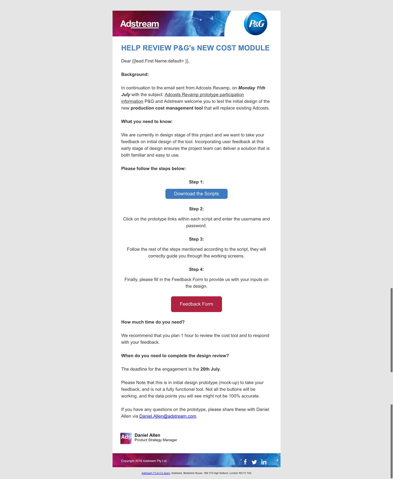
P&G appointed a few key users that fit the use cases above and we sent them an email with a link to the prototype and the respective script. All they had to do was follow the script in order to complete a task (eg. create a new video production cost), while we had tracking running in the background.
These were our actual end users from P&G’s wider teams across the globe so their feedback was invaluable at this point and we knew we had to make really good use of it.
We tracked mouse path information, dwell and completion times, created a few tunnels to monitor drop-off vs completion rates and gathered heat maps to help us figure out whether users were getting stuck and where. This was achieved by using tools such as Hotjar and Mouseflow while the Axure prototypes were being hosted on Axure Share.
Upon reaching the end of the script and completing their assigned task, users were presented with a short survey asking about their general feeling towards the new solution being presented and an open text field for suggestions and/or questions.
Results
All of this feedback was collated in spreadsheet form to which we then added our own comments with action plans and considerations.
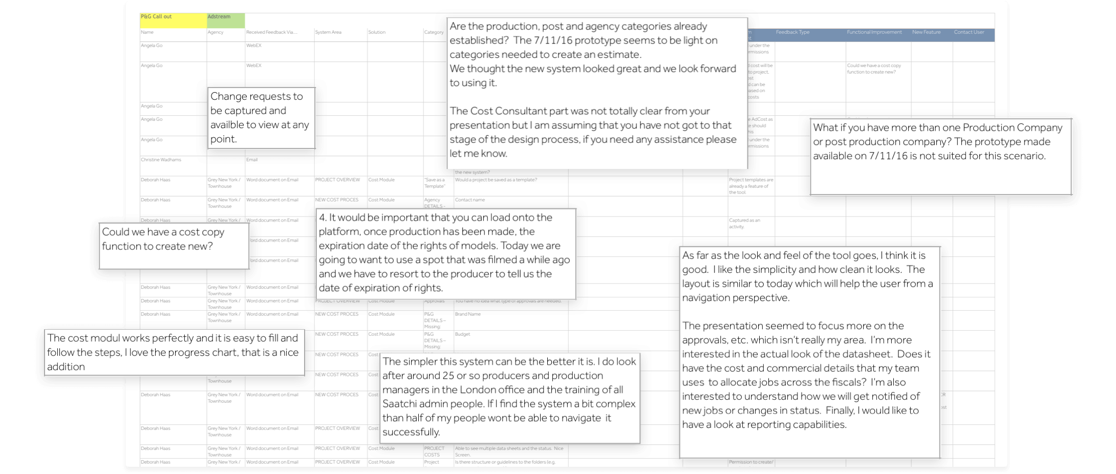
As we didn’t want to make users go through any sort of sign up process, we couldn’t exactly tell which user corresponded to which lines in each report so we cross referenced all this data with their IP addresses to figure out where they were logging in from and make an informed decision on who they were.
These users were used to working a certain way in their previous platform so we knew there was going to be some resistance and possibly use cases we did not foresee, so all this data would help guide our design decisions from this point onwards.
We then redid some of our previous screens in order to accommodate their feedback and after the higher level stages of the process had been defined and validated, we moved on to building a higher-fidelity prototype outlining some of the micro-interactions and incorporating a few copywriting tweaks to clarify some of the actions.
Visual design
Some of the feedback we received during our usability sessions placed particular emphasis on the visual design aspect of what we presented. Users seemed happy with what they got to try out, even though it was still at a very early stage:
I like the simplicity and how clean it looks. The layout is similar to today which will help the user from a navigation perspective.
Head of Marketing,
Drafted Inc. – Boston, MA – USA
The Cost module works perfectly and it is easy to fill out and follow the steps. I love the progress chart, that is a nice addition.
Producer,
Saatchi & Saatchi – London – UK
That gave me a good idea of the things we were doing right and things we should probably change. Earlier in the process, when outlining the user journey maps for the new module, the general approach was that it should be broken down into the stages below. For that reason, I chose to think of the visual design by following this same structure.
Navigation
One of the ideas that popped up during our early explorations was to use a stepper system in order to unify the processes of creating a cost and reviewing a cost. We believed using a similar navigation pattern for both tasks would ellicit some familiarity from the user’s perspective, making the new process easier to understand.
We did extensively explore other ideas as well such as wizards and accordions, which we created visuals for to test internally but nothing came close to being as user friendly as the stepper system in our tests.
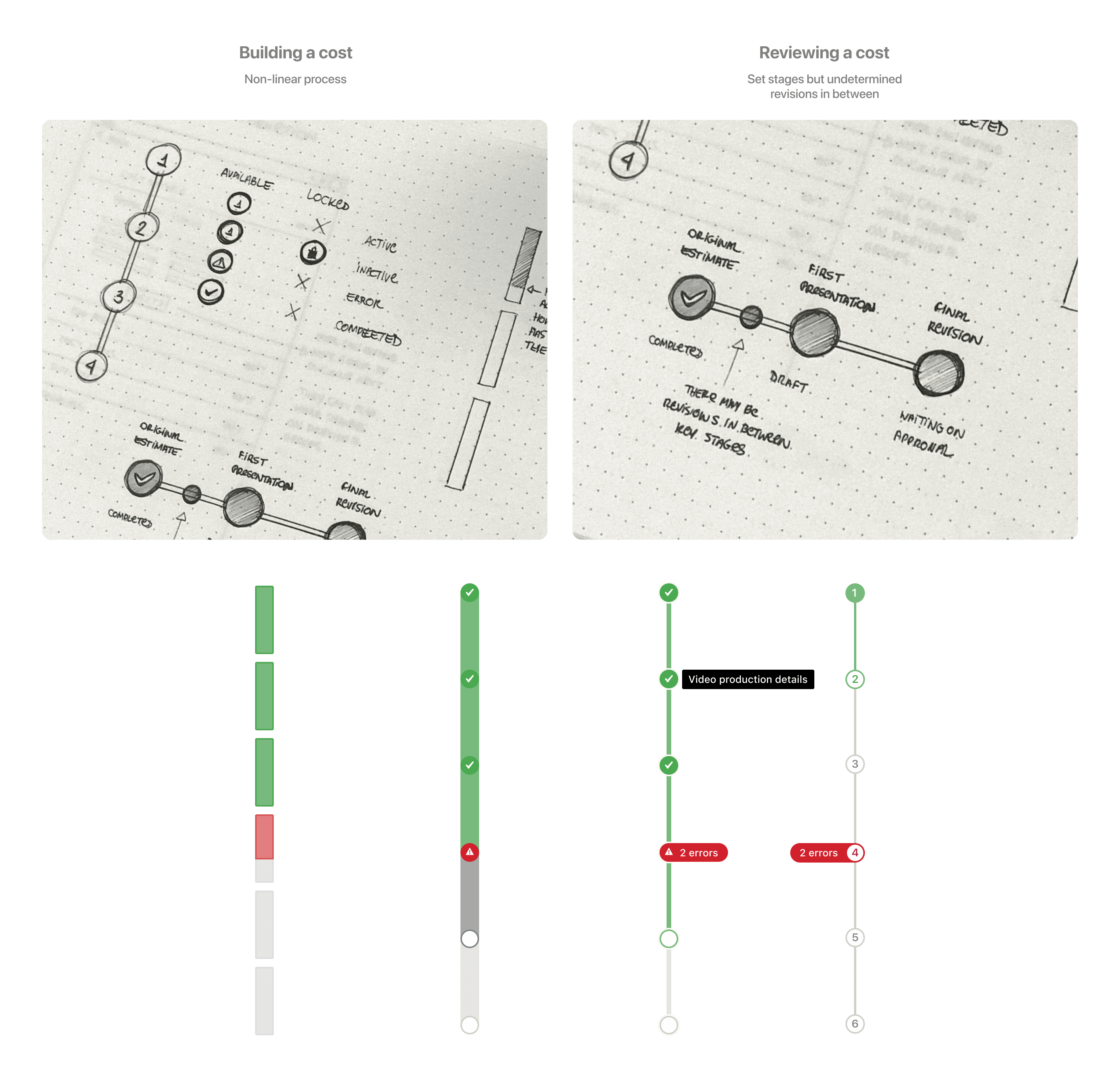
We refined those ideas taking into consideration we needed areas to display errors, indicate progress and completion status and, after several rounds of internal tests, locked it down into the following system:
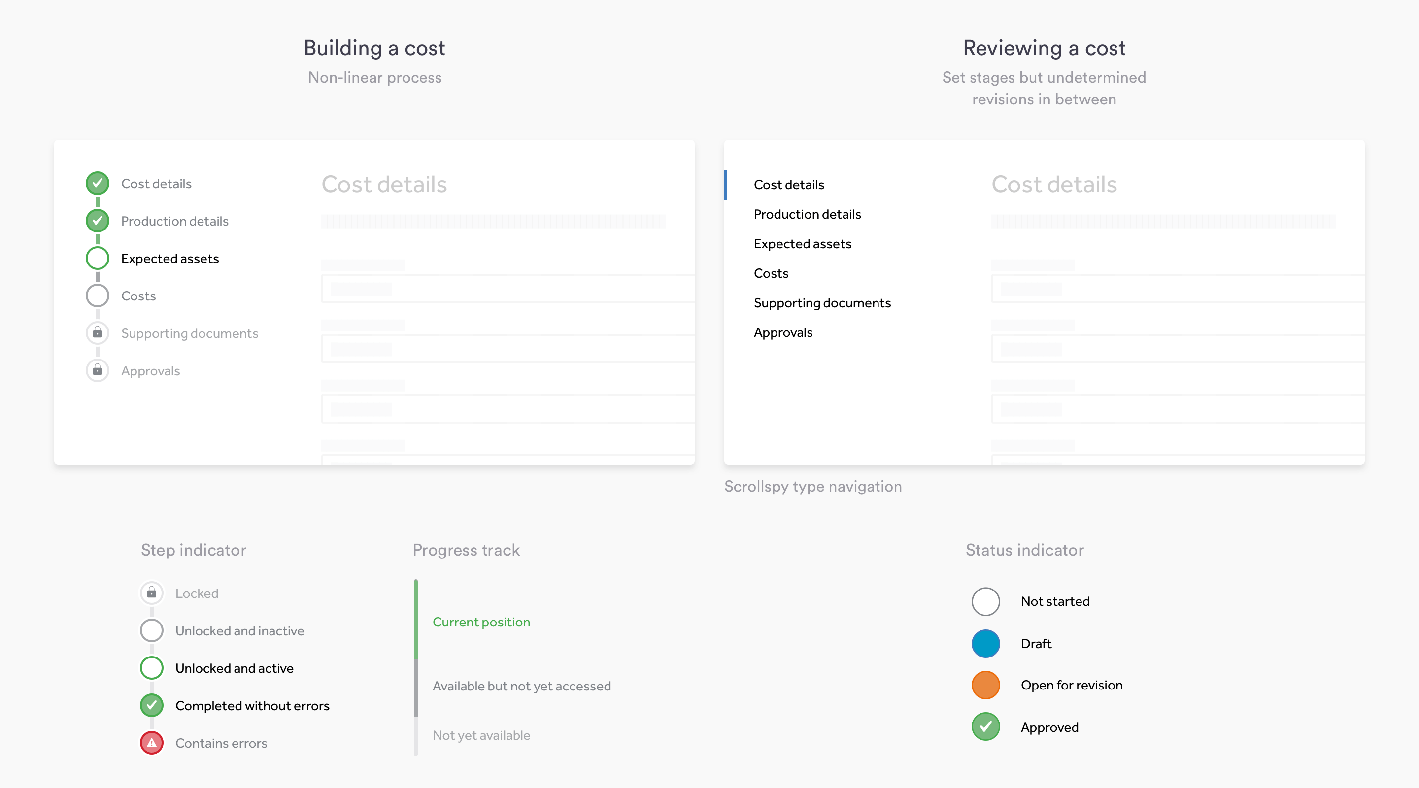
Building a cost
When creating a cost, users should be able to do it in a non-linear fashion. Any changes they make to the form are automatically saved so that they can come back and continue from where they left off until they’ve gathered all the metadata required to submit the cost for approval. We identified early that this was a common use case.
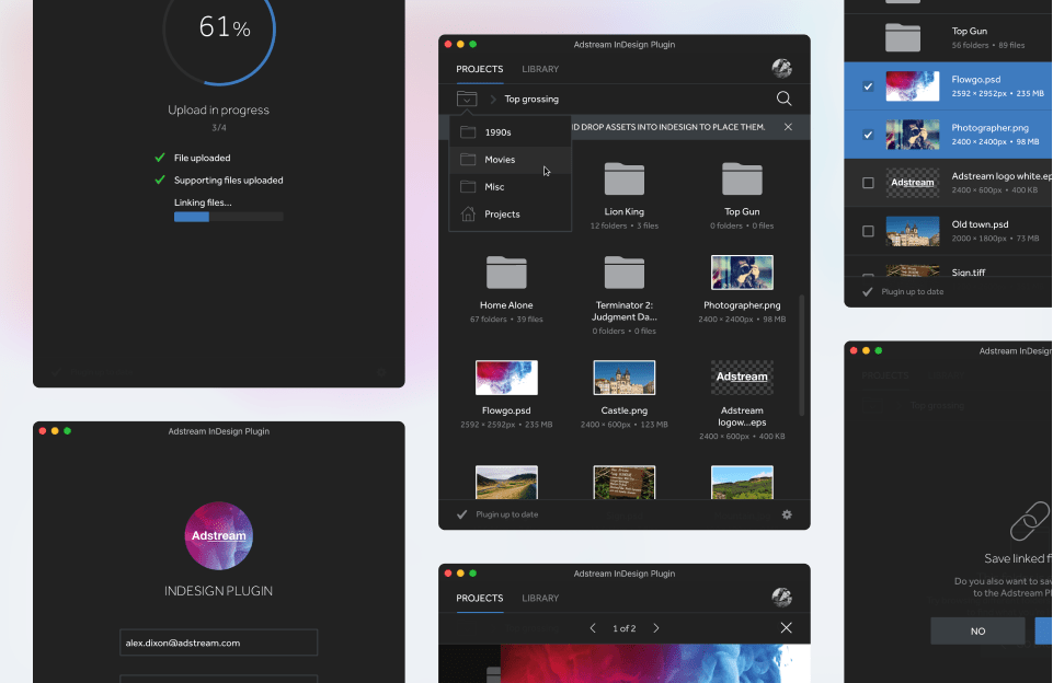
The video below illustrates the overview area as well as the cost creation process.
Navigation Prototype – HTML, CSS and JavaScript
Reviewing a cost
When reviewing a cost, users should be able to clearly see its current stage, status and the amount of revisions it’s had so far. They should also be able to track the changes made between each stage as well as see an activity log of that particular cost.
Navigation Prototype – HTML, CSS and JavaScript
Mobile
On mobile, due to platform limitations and use cases we identified, the initial approach is to allow users to consume content (ie. review an existing cost) rather than create new costs.
Conclusion
The Costs module is currently under development and scheduled for release in late February.
Once shipped, we will then start monitoring usage and keep an eye on our customer satisfaction reports, platform analytics and go out to meet with users to follow up on what this new module feels like to them after they’ve had the chance to use it for a little while.
We’re not aiming at getting everything right the first time, so we will definitely be making adjustments as we gather their initial impressions to make this an even better tool that P&G and other clients can rely on to make their daily lives easier.